Salka Energy
Brand & Web Design
Overview
Salka Energy is a renewable energy company focused on developing, constructing, and arranging financing for utility-scale renewable energy projects — the kind of large-scale infrastructure that shifts regional grids. They specialize in solving challenging development and financing problems that smaller players walk away from.
The engagement was a complete brand and digital presence build from scratch: new brand identity, logo, responsive website, and business card and print collateral. Everything from nothing, delivered as a coherent visual system.
The Challenge
Salka Energy was entering the market as a serious utility-scale player but had no brand presence at all — no logo, no visual language, no website. They needed to establish credibility immediately with the kind of institutional clients, investors, and project partners that the utility-scale energy sector attracts.
The core tension: renewable energy is a highly technical industry where trust and permanence matter, but the company also needed to communicate that it was forward-looking and capable of navigating complex, novel financing structures. The brand had to carry both qualities simultaneously.
- —No existing brand assets or visual direction to build from
- —Audience of institutional partners, investors, and development stakeholders — requiring a credible, professional register
- —Website needed to communicate capability and scale without becoming dense or inaccessible
- —Print and digital deliverables had to work as one coherent system, not disconnected pieces
Blank Slate
No brand, logo, website, or visual system existed at the start.
Institutional Trust
The identity needed to feel credible for investors and project partners.
Energy Sector Clarity
Complex renewable work had to read quickly without generic green clichés.
Digital Credibility
The website had to establish scale, capability, and professionalism fast.
The design work had to establish Salka Energy as a company that looked like it belonged in the same room as the organizations it was trying to work with.
My Role
I handled the full scope — brand identity through front-end development. This was not a project with a handoff between design and development; I owned both tracks.
- —Developed the brand identity: visual language, color, typography, and logo
- —Designed the responsive website across all breakpoints in Adobe XD
- —Built the site in WordPress with custom PHP, HTML5, and CSS3
- —Designed business card and print collateral to complete the identity system
- —Managed the project from brief through delivery without a separate project manager
Brand Identity
Created the mark, palette, typography, and core visual language.
Responsive Web
Designed layouts across breakpoints with clear hierarchy and pacing.
Front-End Build
Built the WordPress site with custom PHP, HTML5, and CSS3.
Print System
Extended the identity into business cards and physical collateral.
Research & Process
The process started with the brand problem — understanding the competitive landscape for utility-scale renewable energy companies and identifying what visual and verbal signals communicated credibility in that space. The sector tends toward either generic green-energy iconography (solar panels, wind turbines, abstract leaf motifs) or overly technical, corporate-gray aesthetics. Neither served Salka well.
The goal was a brand identity that communicated seriousness and permanence — qualities that read as trustworthy to institutional partners — while using visual language that suggested forward motion and capability rather than incumbency. That meant restraint in the logo, deliberate use of white space, and typography that leaned into authority without being stiff.
With the identity direction established, I moved into web design: mapping the site architecture to the company’s actual value propositions (development expertise, financing capability, project delivery), then designing page layouts that let those capabilities read clearly without requiring dense copy.
Solution
The deliverable set:
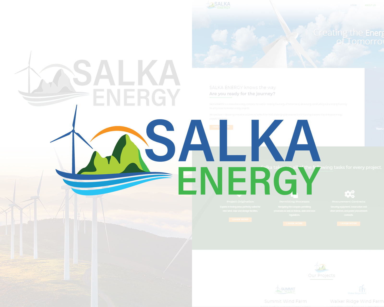
The brand identity combined a refined, mark-based logo with a clean editorial palette — professional enough for institutional audiences, distinctive enough to stand apart from both the green-energy clichés and the gray-corporate defaults of the sector.
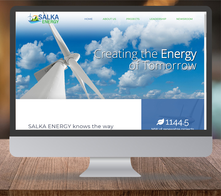
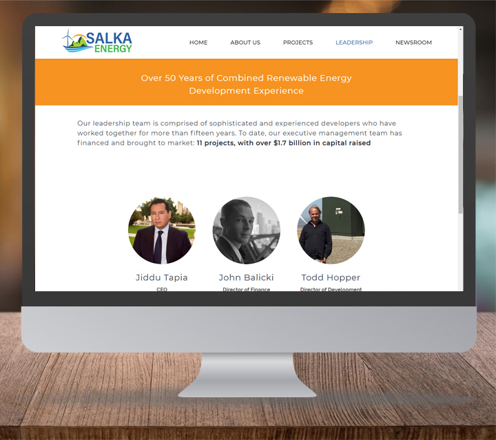
The website was structured around the company’s core service areas, with enough depth to satisfy informed partners and enough clarity to communicate quickly at a glance. Responsive across all breakpoints, built on WordPress for ease of ongoing maintenance.
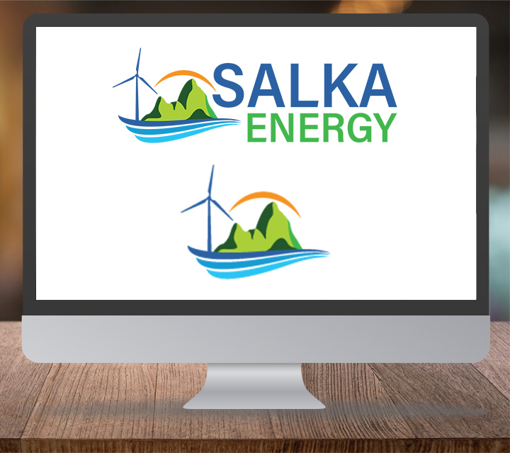
- —Logo and brand mark — designed for use across digital and print without degradation
- —Responsive website built in WordPress with custom PHP, HTML5/CSS3
- —Brand color and typography system applied consistently across all surfaces
- —Business card and print collateral — completing the identity system for in-person use
Visual System
A cohesive identity that could scale across web and print.
Market Presence
Salka launched looking established, serious, and partner-ready.
Collateral Ready
Digital and print materials spoke the same brand language.
End-to-End Delivery
Design, development, and launch were owned as one complete track.
The result was a coherent visual system that Salka Energy could deploy across every touchpoint without requiring ongoing design support for each new use.
Impact
The engagement delivered a company-ready brand from a blank slate. Salka Energy launched with a professional visual presence that held its own in the institutional and investor contexts the company operates in.
- —Complete brand identity — logo, visual language, and guidelines — delivered from nothing
- —Responsive website live at salkaenergy.com, built and deployed end-to-end
- —Reusable visual system spanning web and print, with no gaps between surfaces
- —Created a scalable design foundation the company could grow into without needing to rebuild
Results & Impact
The project demonstrated that serious institutional credibility doesn’t require generic convention — a disciplined visual identity built from clear principles can establish trust quickly and scale across every medium without losing coherence.
Tools
Scope
More work in the index.