Joybird
E-commerce UX Optimization
Overview
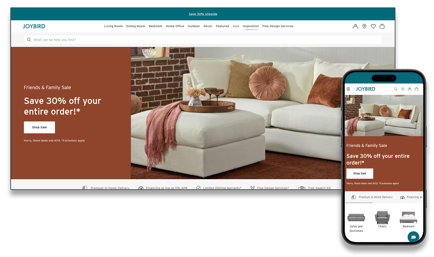
Joybird is a direct-to-consumer furniture brand owned by La-Z-Boy, focused on custom, modern furniture. The website is the primary sales channel — every UX decision directly affects revenue.
As Lead UX Merchandising Analyst, I worked at the intersection of UX design, merchandising strategy, product management, and analytics. The role sat between design, engineering, creative, and merchandising — translating business goals and behavioral data into improved shopping experiences.
My work centered on product-page redesign, conversion optimization, and data-driven experimentation across the catalog.
The Challenge
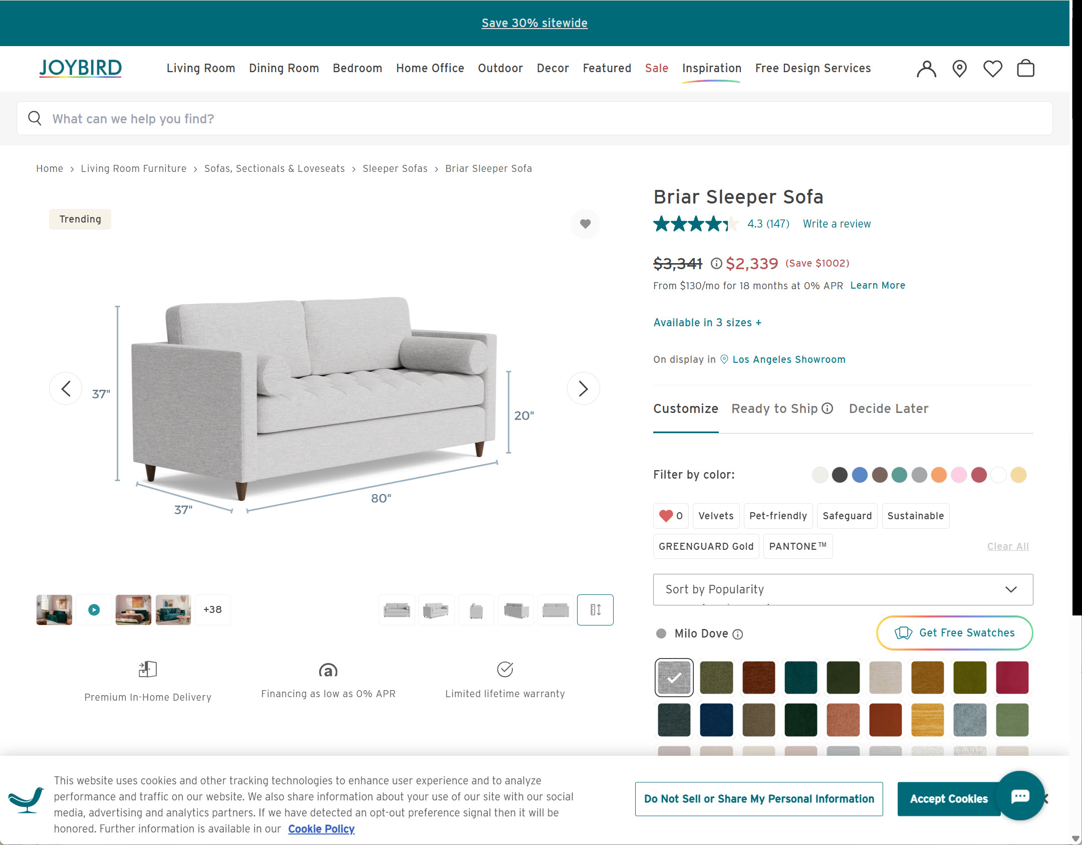
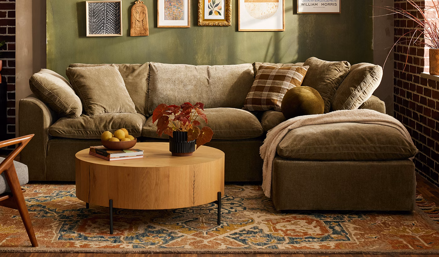
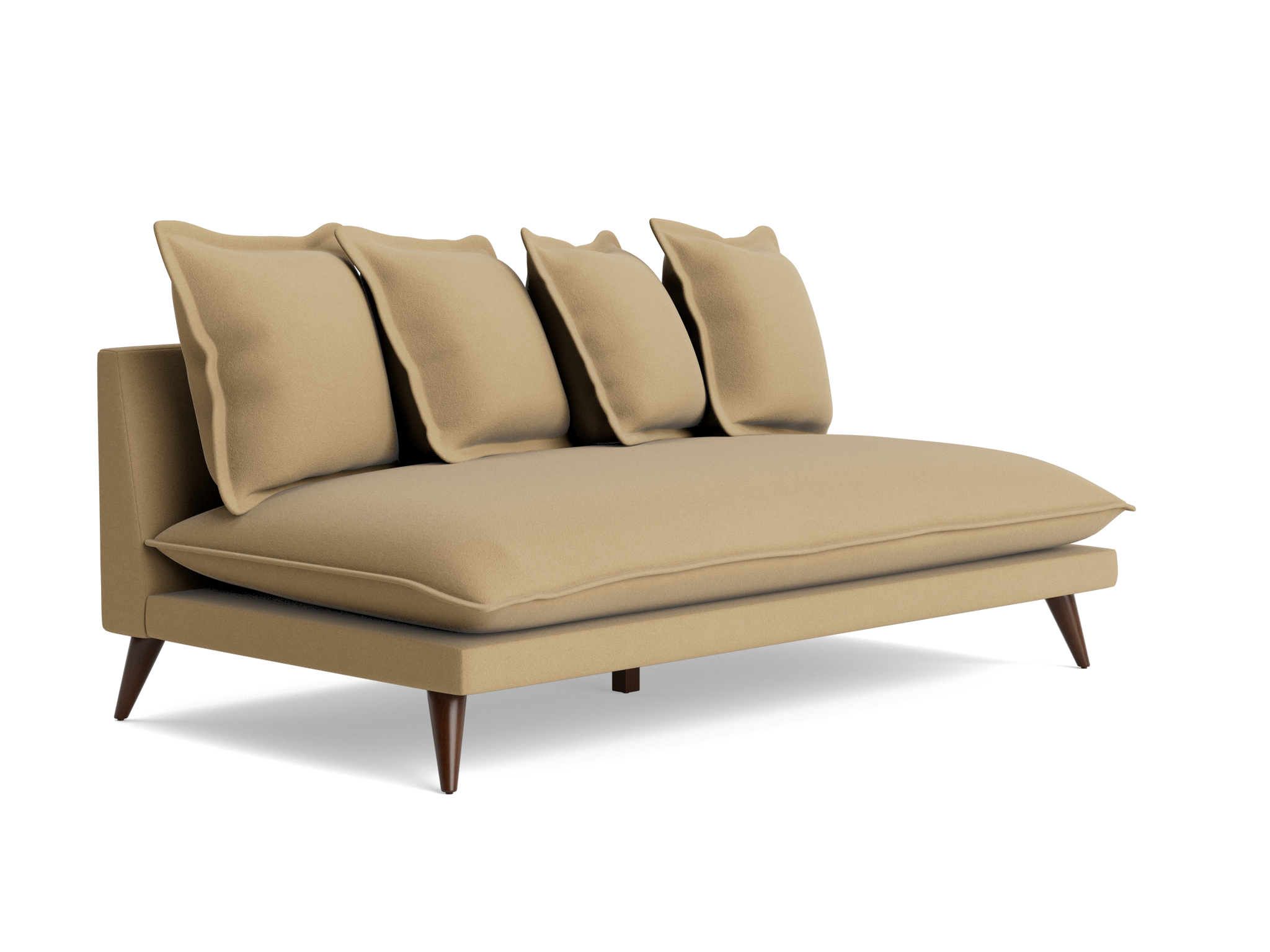
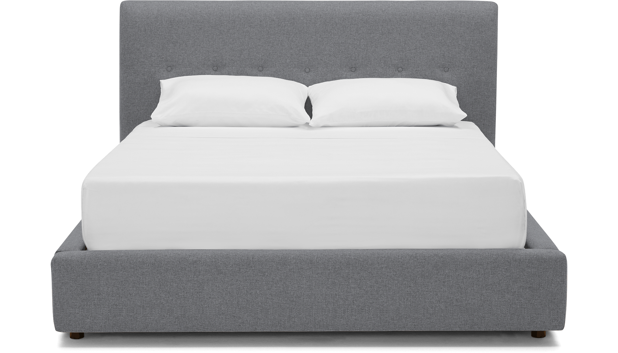
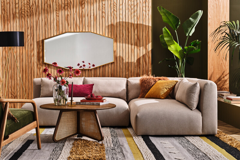
Joybird sells highly configurable furniture — fabric, finish, leg color, size, and custom options — which creates a complex, high-consideration buying journey. Customers had to navigate hundreds of products, evaluate extensive configuration options, visualize materials from swatches, and weigh pricing and delivery timelines, often without touching the product.
The UX challenge was to simplify this process without removing the flexibility that makes Joybird's catalog valuable.
- —Product pages carrying too much complexity without clear hierarchy
- —Configuration flows with friction at the fabric and finish selection stage
- —Limited visual storytelling for collections and featured product families
- —Unclear paths for customers comparing similar products at different price points
Configurable Catalog
High-consideration furniture with fabric, finish, size, and delivery tradeoffs.
Choice Overload
Fabric and finish selection needed to feel clear, visual, and lower risk.
Decision Signals
Price, delivery, fabric, and imagery had to surface earlier in the page.
Comparison Paths
Customers needed easier ways to compare similar products and options.
Each of these issues had a measurable effect on engagement, time-on-page, and conversion — all tracked through A/B testing and analytics.
My Role
I worked across product, engineering, creative, and merchandising — a cross-functional role that required translating business objectives into UX decisions and UX findings into actionable experiments.
- —Redesigning product pages to improve information hierarchy and reduce configuration friction
- —Designing new merchandising modules to spotlight collections and featured products
- —Mapping and optimizing conversion flows, from category browse through configuration to add-to-cart
- —Partnering with analytics and product teams to define A/B test hypotheses and interpret results
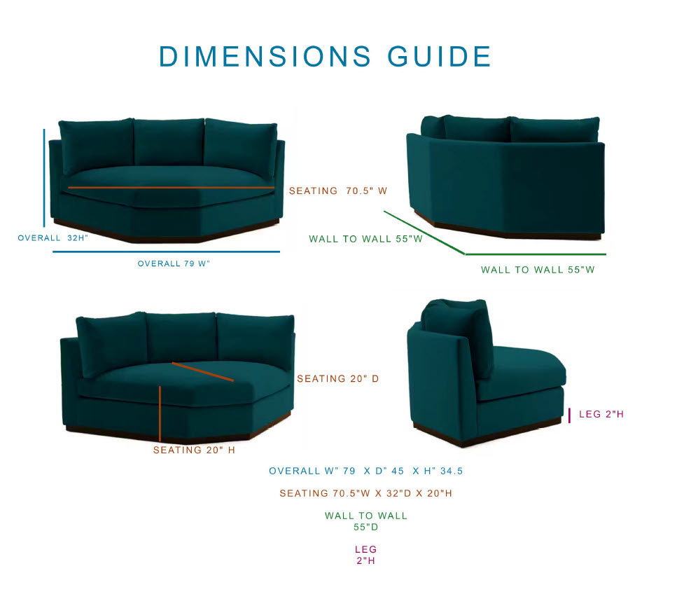
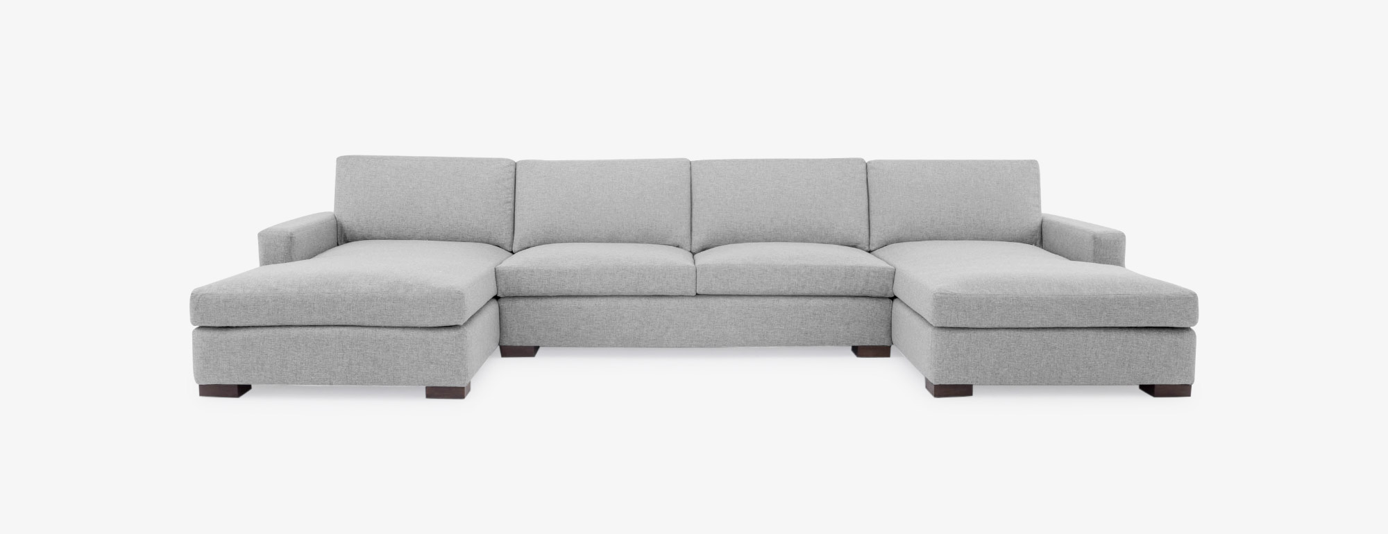
- —Managing the 3D asset library powering product visualization across the site
- —Running UAT before releases to validate design intent matched production behavior
Product UX
Redesigned product pages and option flows around real shopping behavior.
Analytics Lens
Used funnel data, heatmaps, and tests to decide what changed and why.
A/B Testing
Translated UX hypotheses into measurable experiments before rollout.
3D Asset Library
Managed visualization assets that helped customers understand custom products.
The role demanded both design craft and analytical rigor — shipping UX changes wasn't enough without understanding their effect on the metrics that mattered to the business.
Research & Insights
Research drew on website analytics, conversion funnel data, heatmaps, scroll depth, behavioral recordings, and merchandising performance metrics — the full picture of how customers actually moved through the experience.
Two patterns dominated the findings.
- —Configuration overload: customers frequently abandoned or stalled at the fabric and option selection step, not because the product was wrong for them but because the interface made choosing feel high-risk
- —Price, delivery timeline, and fabric thumbnails drove the most engagement — but product pages buried these details below the fold and behind interactions
These findings drove a clear reprioritization: surface what customers actually use to make decisions, earlier and more prominently, and reduce the cognitive weight of configuration choices.
Design Process
The process ran in iterative cycles: define a problem area from the data, design solutions in Figma, validate assumptions with the product and engineering team, ship a variant, measure the result. Repeat.
Key work included redesigning product page information hierarchy to lead with the signals customers used most — price, delivery window, and fabric — and restructuring configuration flows to make option selection feel decisive rather than exhausting. Merchandising modules were designed as reusable, scalable patterns that the creative and merchandising teams could operate independently. Every significant change went through an A/B test before full rollout.
Solution
The updated experience made it straightforward for customers to:
The redesigned product experience restructured information hierarchy around what customers needed to decide — not what the platform found easiest to serve. Configuration flows were simplified and sequenced to reduce abandonment at the option-selection stage.
- —Lead with price, delivery window, and fabric thumbnails — the three signals customers used to evaluate a product — rather than burying them below secondary content
- —Simplify configuration UI to make option selection feel low-risk and reversible, reducing stall-out at the fabric and finish step
- —Add collection-level merchandising modules to help customers shop by aesthetic and use case, not just individual SKU
Clear Hierarchy
Key buying information moved into the first decision zone.
Visual Merchandising
Reusable modules helped collections feel curated, not just listed.
Scalable Patterns
Merchandising and creative teams could launch with less design dependency.
Less Friction
Configuration felt more guided and reversible across the buying path.
The resulting design system made it easier for merchandising and creative teams to launch new products and campaigns without requiring design involvement for every update.
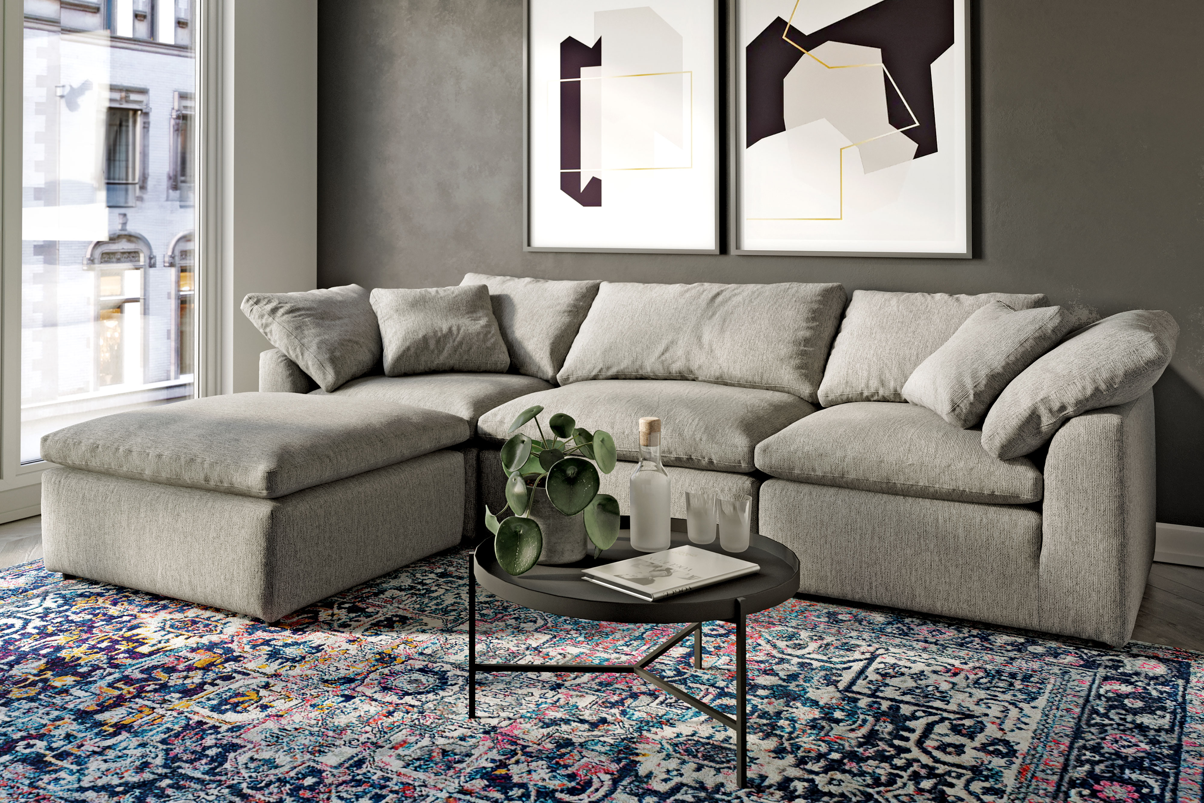
From product detail to product confidence.
Selected Joybird visuals from product-page optimization, collection merchandising, and the configurable asset system behind the shopping experience.
Results & Impact
The work demonstrated that complex, configurable e-commerce doesn't have to feel complex to the customer — clear hierarchy, sequenced configuration, and data-validated decisions are the design levers that close the gap between browsing and buying.
Tools
Collaborated with
More work in the index.