Vitu
MVD Your Way
State of Montana
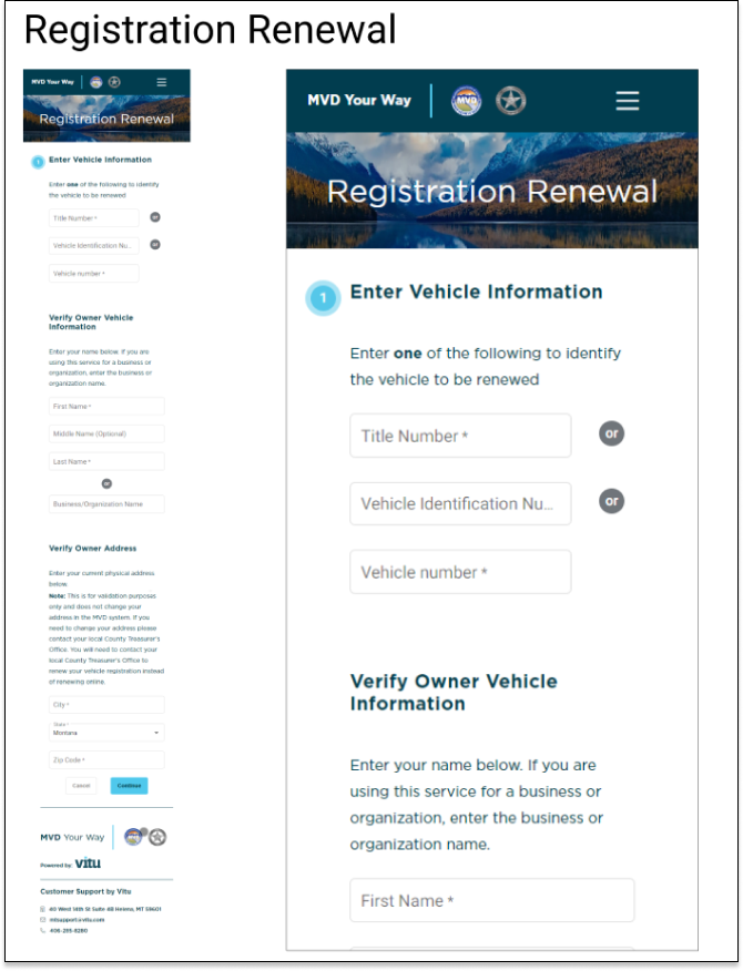
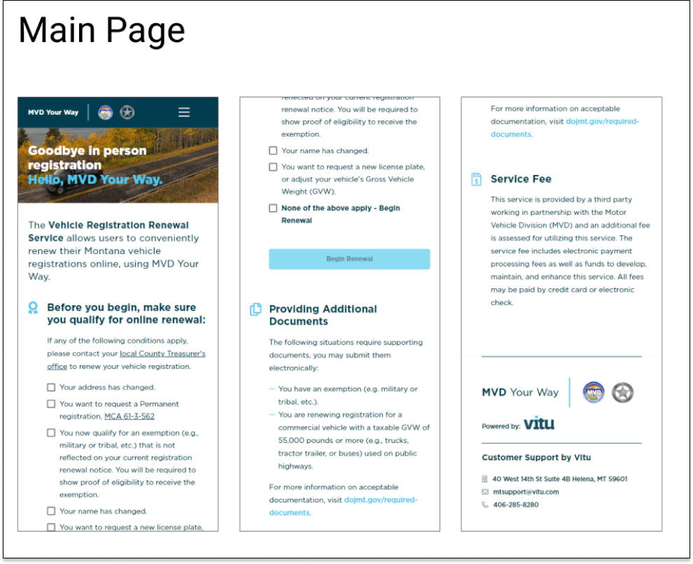
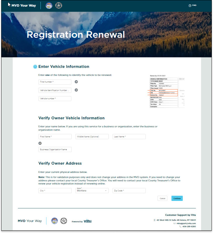
The introduction of the Online Renewal Service provides users with a convenient way to renew their products using MVD Your Way.
Project Context
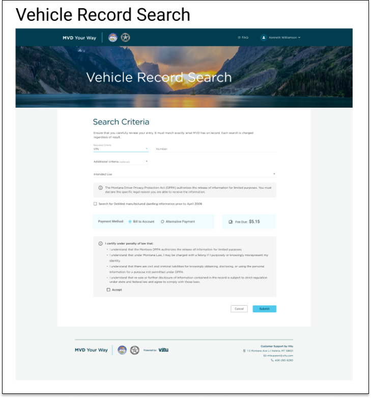
In response to the State of Montana’s request, we embarked on a mission to develop a seamless online platform for Vehicle Title Online Renewals, Driver License Online Renewals, and Vehicle History Online Searches. Our primary objective was to deliver an effortless and efficient user experience, enabling the citizens of Montana to conveniently access these services through desktop or mobile devices.
As this project involves sensitive information, I must maintain confidentiality and cannot provide all visuals or elaborate on the application’s complete workings. However, if you are interested in learning more about this project, I would be more than happy to discuss it further. Please feel free to contact me.
Timeline
The past 12 weeks have flown by in a flash. Apart from the initial onboarding training in the first week, I dedicated the remaining 11 weeks to working on various projects. In the second week, I conducted user studies, and by the third week, I was already immersed in my first project. Throughout the internship, I had regular check-ins with my manager and received valuable design critiques from cross-functional team members three times a week.
Amidst countless explorations and iterations, I diligently worked on my projects. The culmination of my efforts came during week 10 when I confidently presented my work to my teammates and fellow interns. Reflecting on the timeline, I am amazed at how quickly the 12 weeks passed. However, this internship has been a transformative experience, equipping me with numerous new skills that have undoubtedly made me a better designer.

Discovery
Understanding the needs of the people:
During the initial phase of my research, I conducted interviews with 4 Motor Department Employees to gain insights into how we could simplify their day-to-day tasks. Through these interviews, I sought to understand their experiences with the manual renewal process and their approach to learning new tools.
Gaining insights into the new process:
Following the interviews, I proceeded with a competitive analysis, studying how other products address similar challenges. I selected 3 competitive services to compare their onboarding flows and examined 3 well-established design systems to learn best practices for delivering an exceptional service renewal experience.
Insights
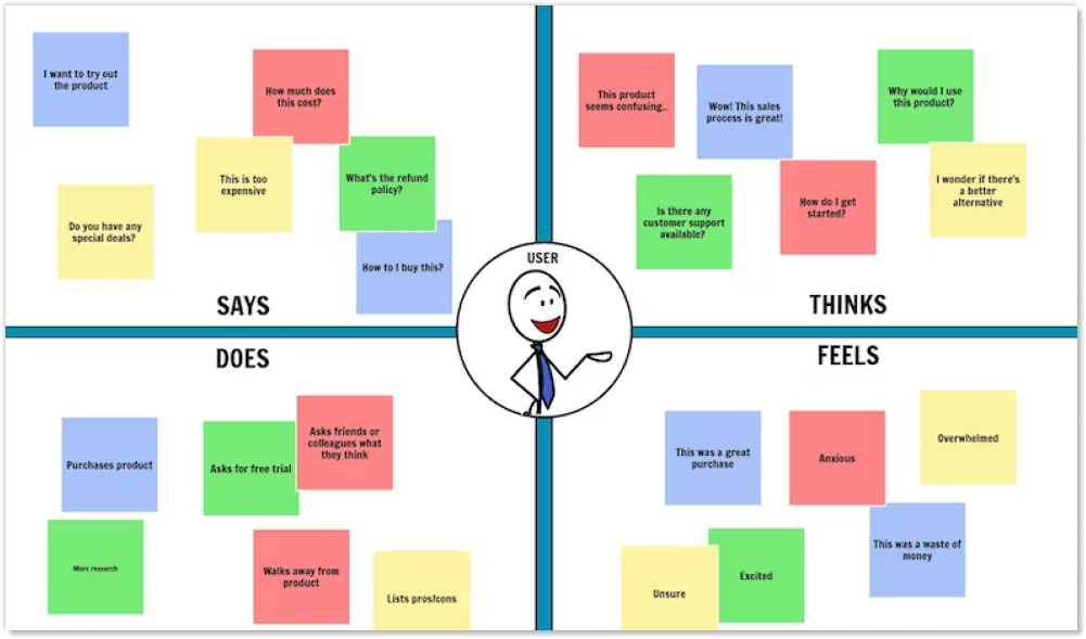
After gathering the user interview recordings, my teammate and I collaborated on affinity mapping to synthesize the pain points identified. By grouping these issues under common themes and platform features, we gained valuable insights to inform our design decisions.
Design Goals
How can we create a simple and secure process for users to renew their vehicle title and driver license?
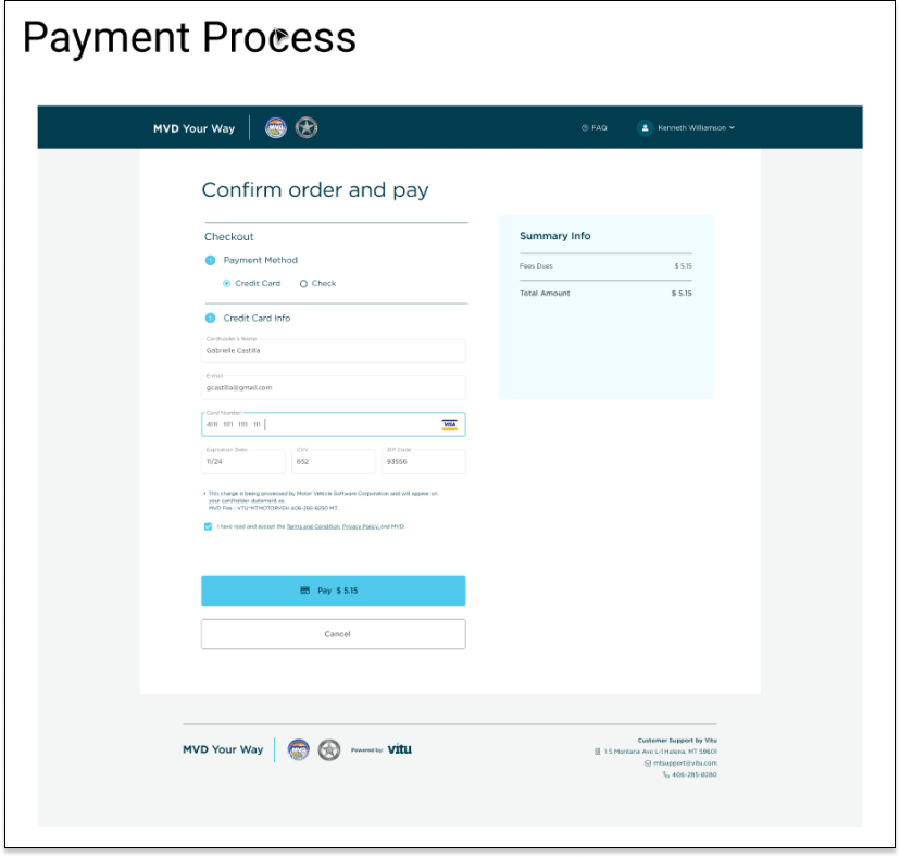
After conducting thorough research, we identified a gap in the forms and information submission process. To address this, we developed a secure and optimized approach that asks only essential questions to ensure accurate information retrieval. Our solution includes an efficient online payment system. Once we secure the necessary information and payment, the Department of Motor Vehicles can promptly initiate the renewal process and submit it to the owner. Our goal is to streamline the renewal experience, making it simpler, more secure, and hassle-free for all users.
Showcase
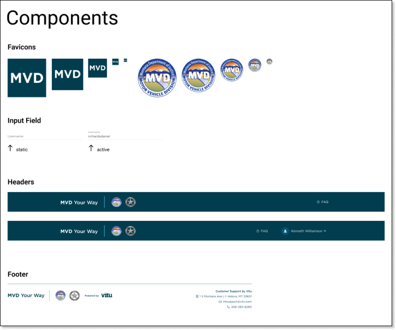
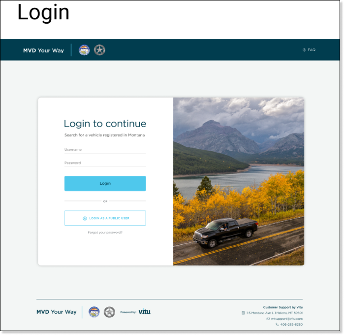
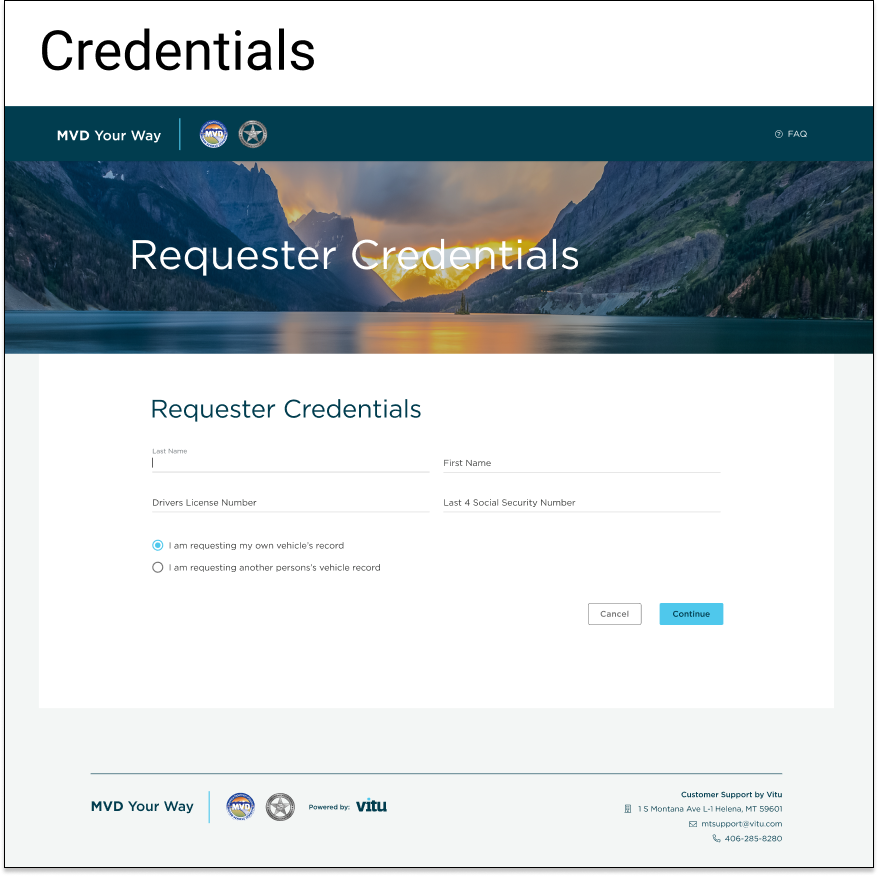
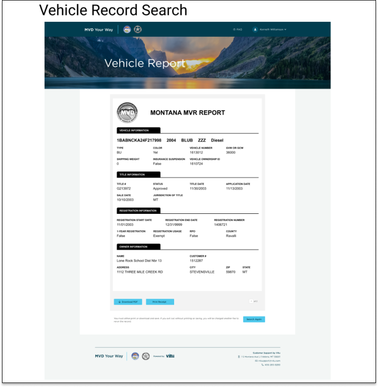
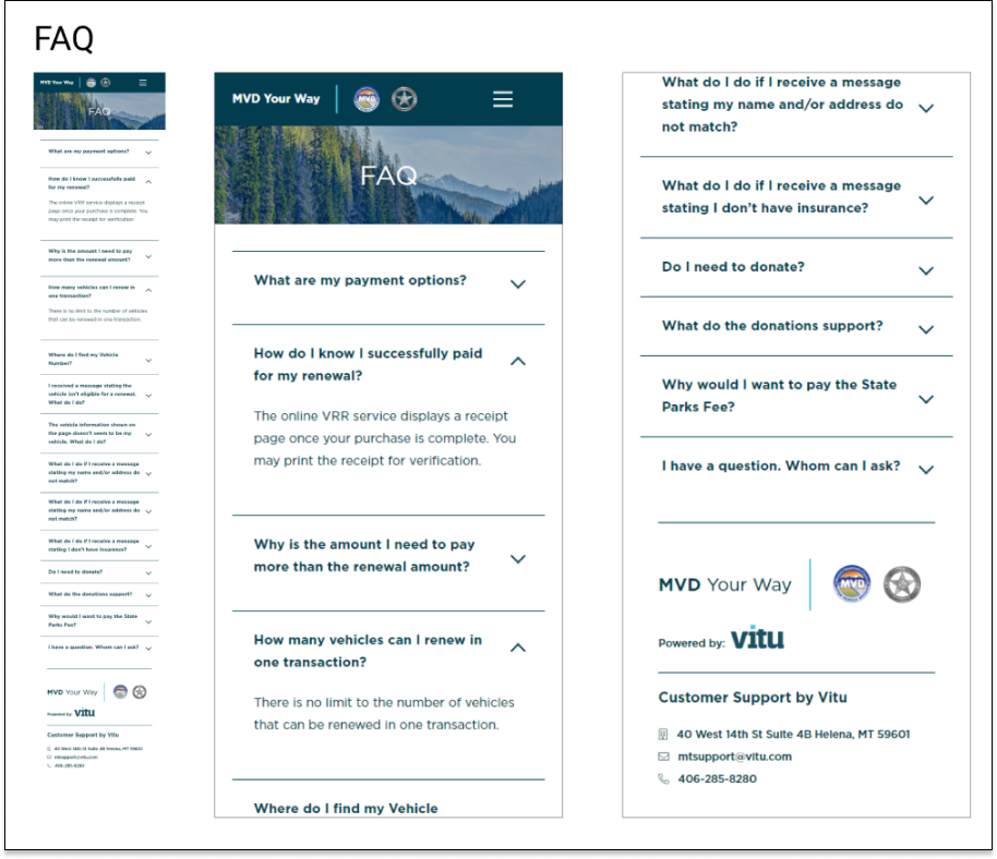
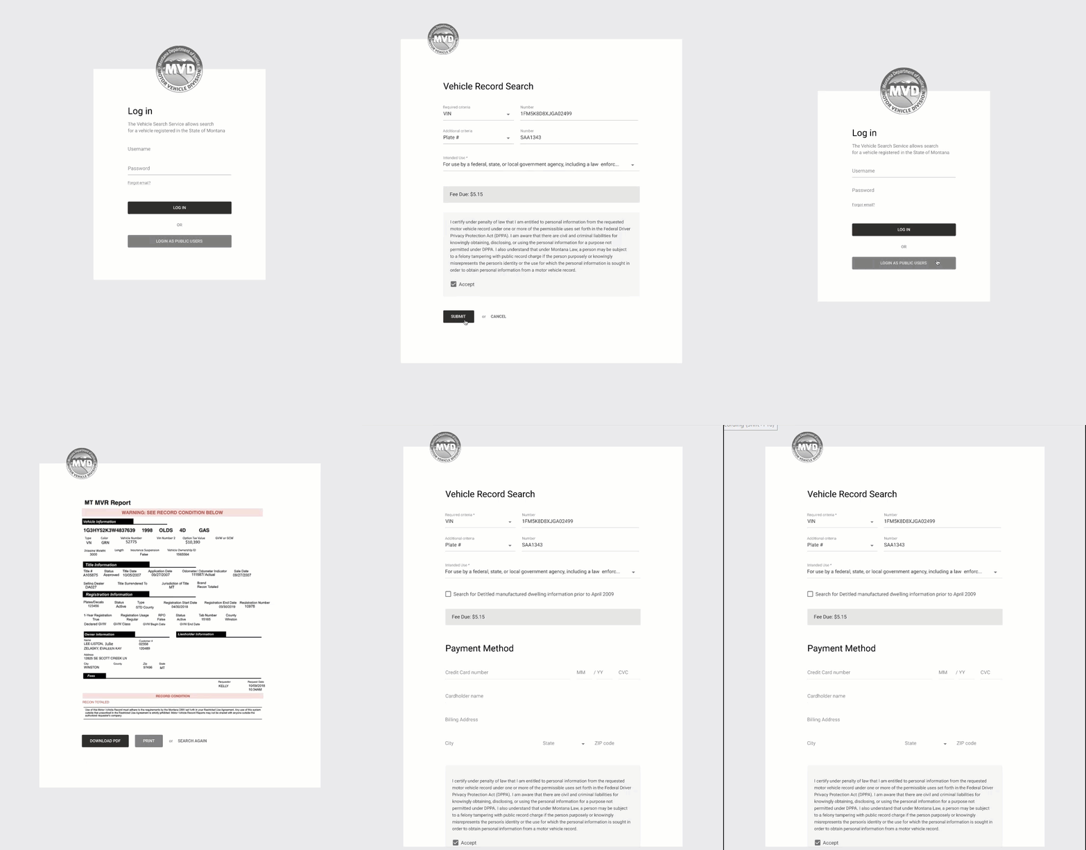
At the conclusion of the three-month project, I delivered the design specifications for the initial product version. The product team and researchers are conducting usability tests, and we will iterate based on the valuable feedback we receive.
Reflections
Creating an early-stage product allows for more flexibility, but it also comes with a heavier workload.
Being the sole designer on the team offered me the freedom to explore various design options and user interactions. However, it also meant I had to create mockups for every screen, which was a considerable workload. Despite the effort, this experience allowed me to delve into neglected aspects like onboarding, account settings, and profile setup flows. Consequently, I developed a comprehensive understanding of end-to-end mobile application experiences and product strategies.
The project was propelled by effective internal communications.
Working directly with Engineers and PM was a great experience for me. I discovered a Figma plugin that made it easier to export code and design attributes for Engineers, reducing the workload for design specs. Collaborating with the PM involved extensive discussions and reviews, helping me understand project requirements better and justify my design decisions. Efficient internal communication motivated the team and drove the project in a positive direction.


