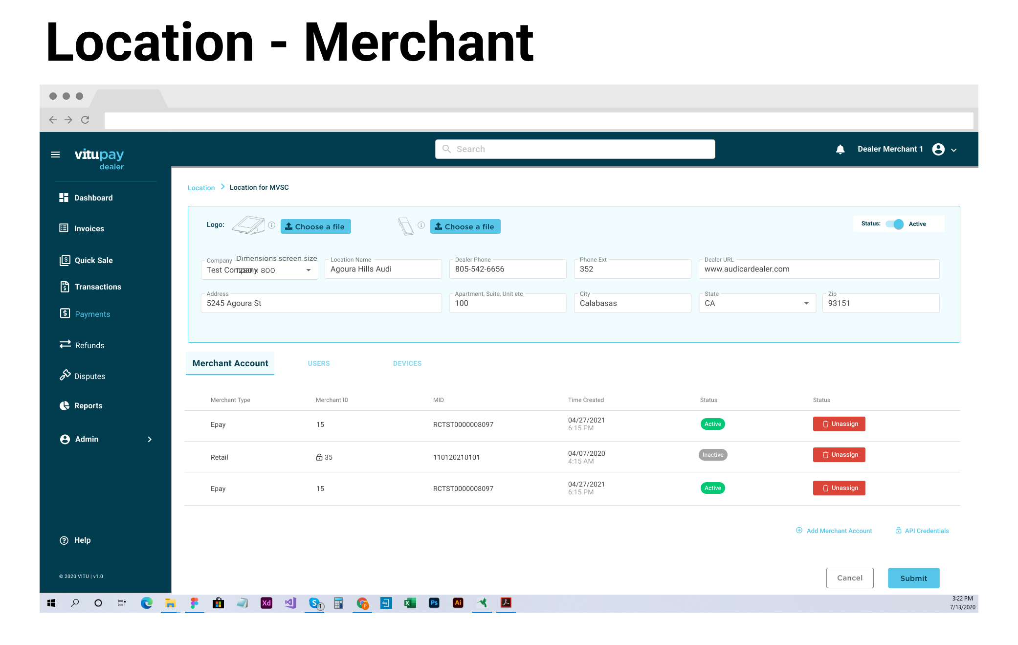
Vitu Pay Dealer
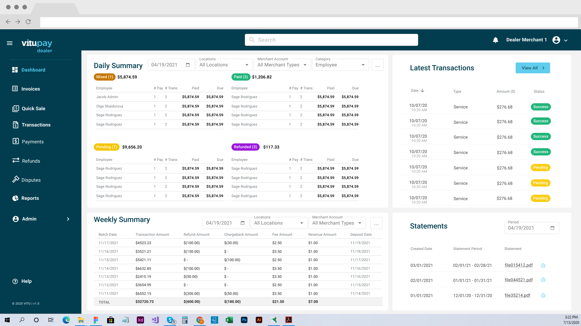
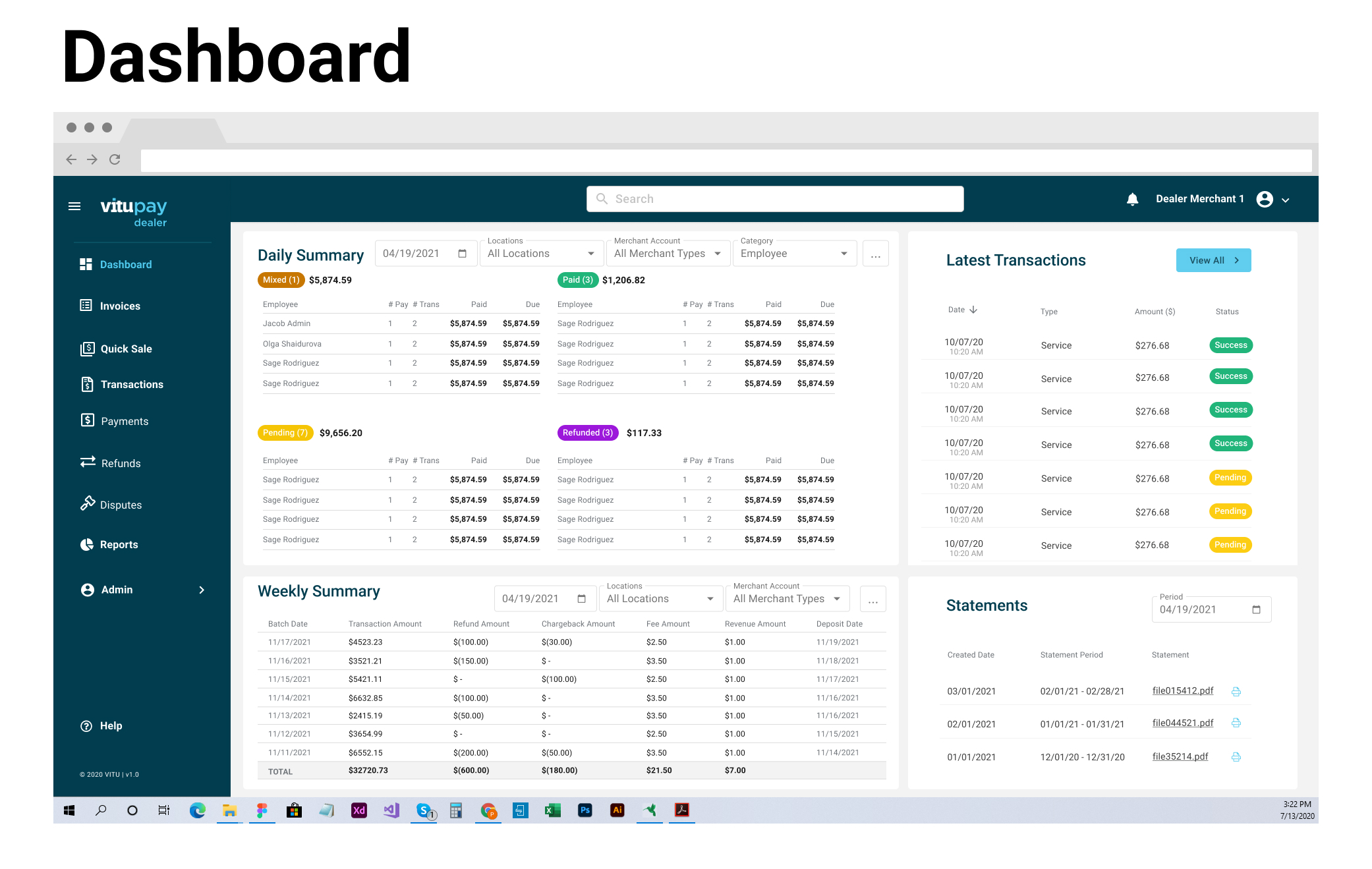
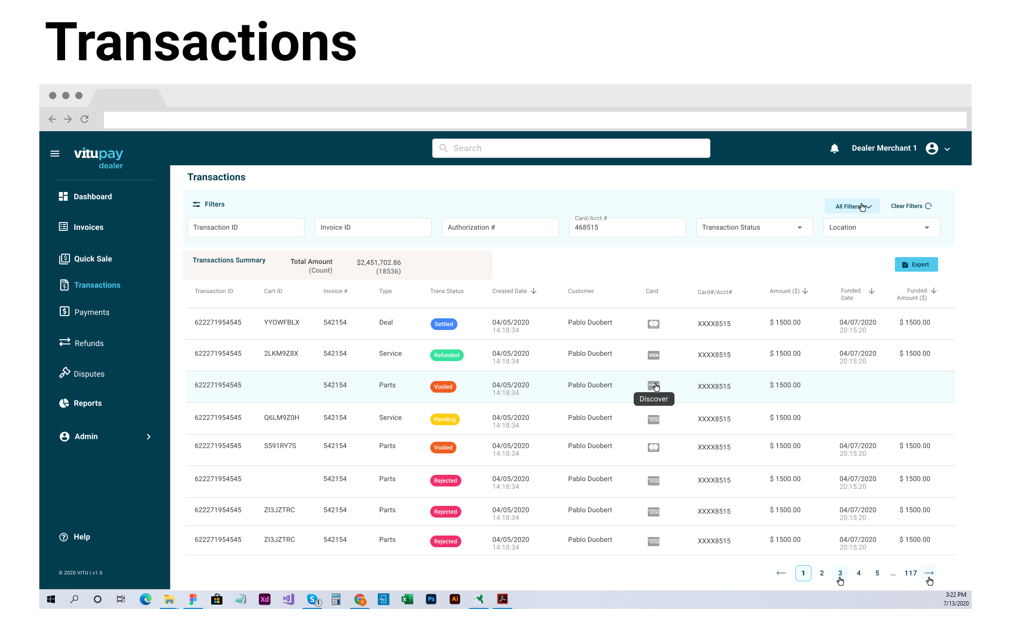
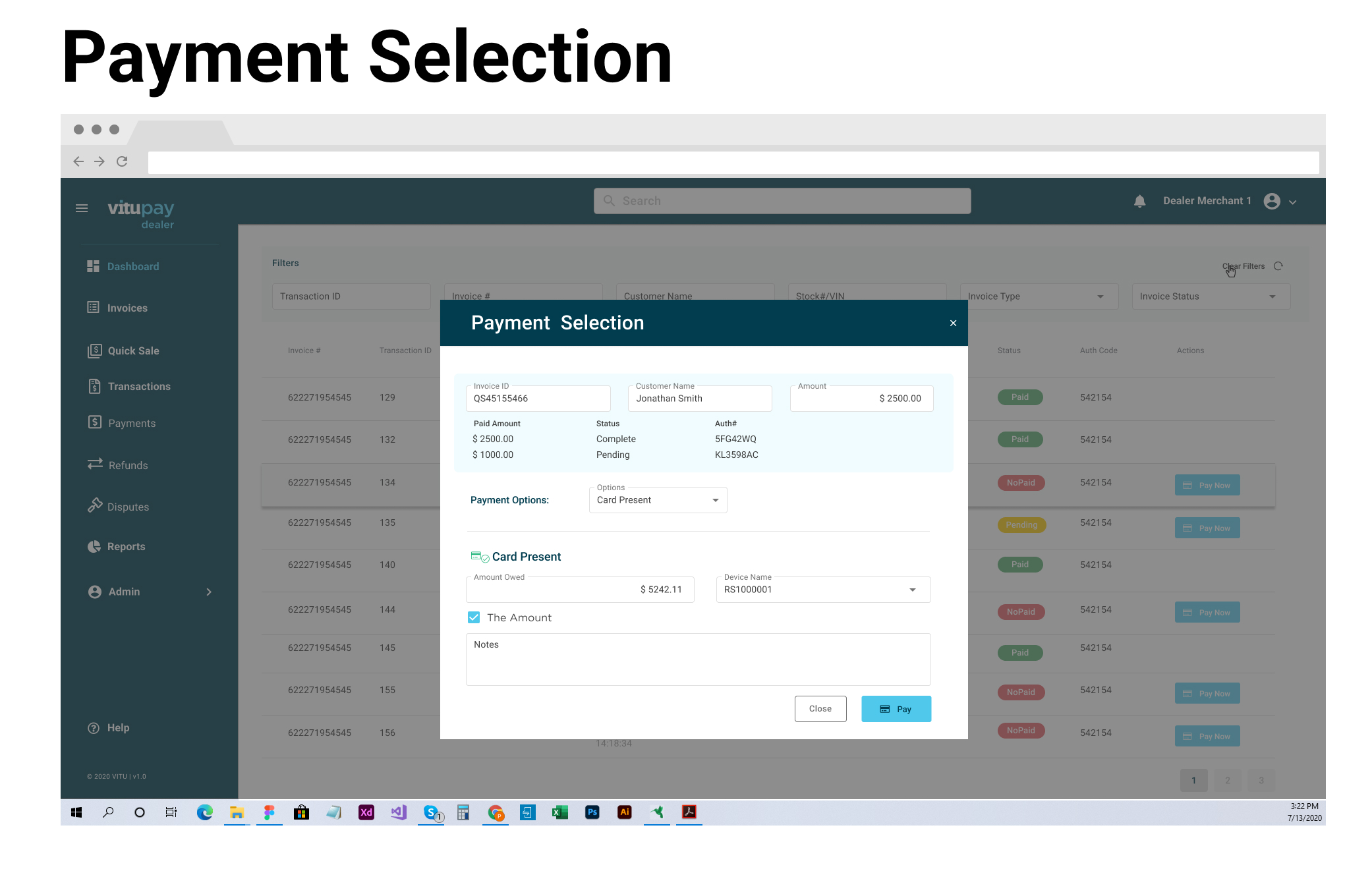
A payment solution designed to simplify the payment process for auto dealers. The solution seamlessly integrates with the Dealer Management System (DMS). It provides a user-friendly experience for dealers, with features such as payment processing, detailed analytics and reports, and easy refunds.
Project Background
I was brought on board to spearhead the development of a new Payment Processing system for dealers. The primary objective was to seamlessly integrate our Point of Sale (POS) with the existing Dealer Management System (DMS). To achieve this, I collaborated closely with the Project Manager, developers, and stakeholders to gather comprehensive requirements for the project.
In order to enable touch-free payments, we formed partnerships with FirstData and Clover. Once the project was successfully completed, the company recognized its potential and took it a step further by offering a white label option tailored for government entities.
Timeline
The project started with the goal of a 12-month delivery timeline, but the impact of Covid disrupted our plans, and in the end, the entire project took from 18 to 24 months. During the first month, we worked on gathering all the requirements and soon realized that the project was more complex than initially anticipated. We needed to bring on additional developers to assist with the communication between the DMS, Clover Hardware, and ultimately, the Bank.
By the eighth month, we began working on the front-end development, which helped us identify more interactions needed to create a seamless project. We conducted tests with the dealers and explored different “What If?” scenarios to ensure the project’s perfection. Our MVP app was delivered to beta testers, and we continued to make minor adjustments.
Discovery
Considering the users’ needs
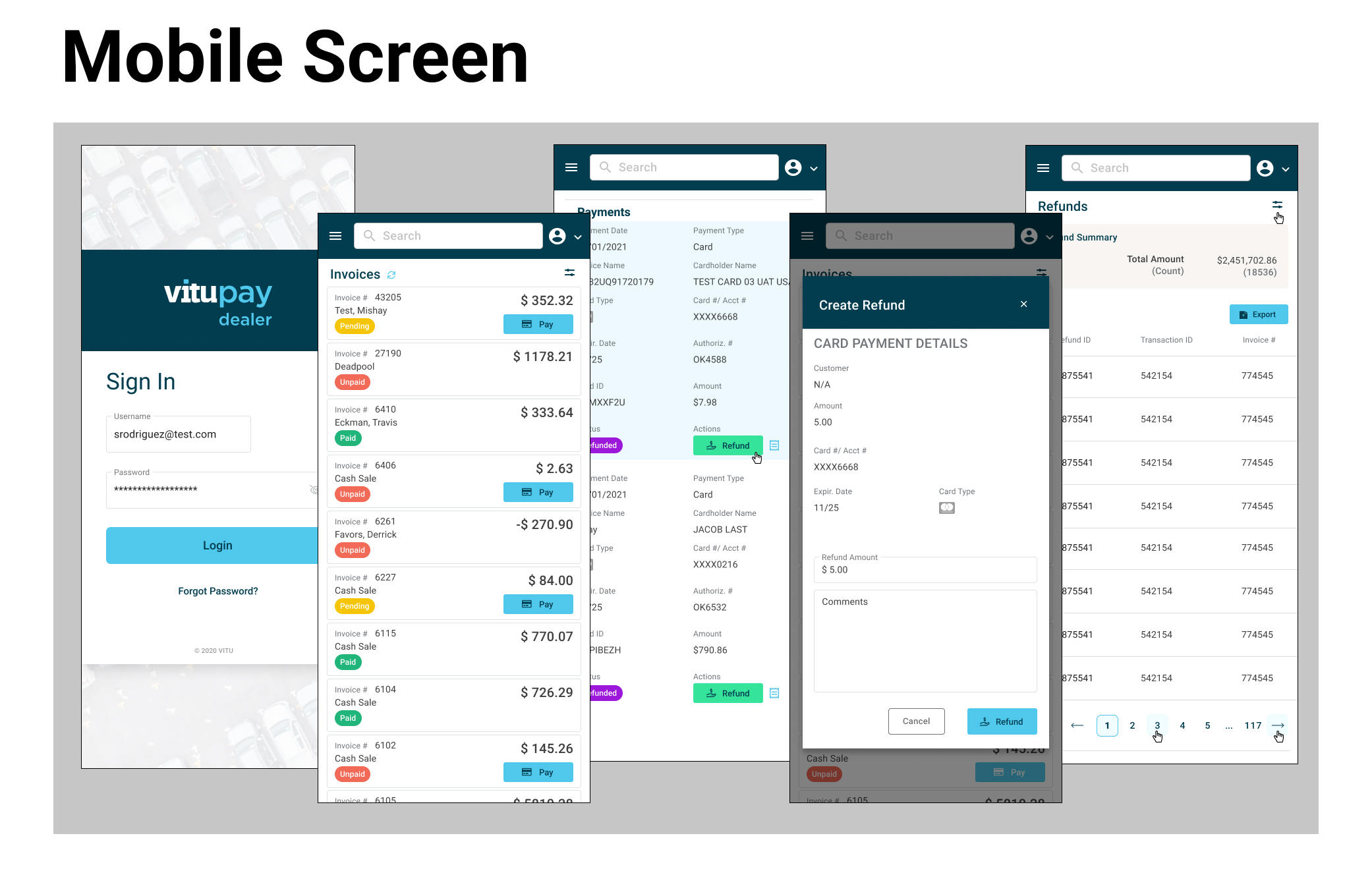
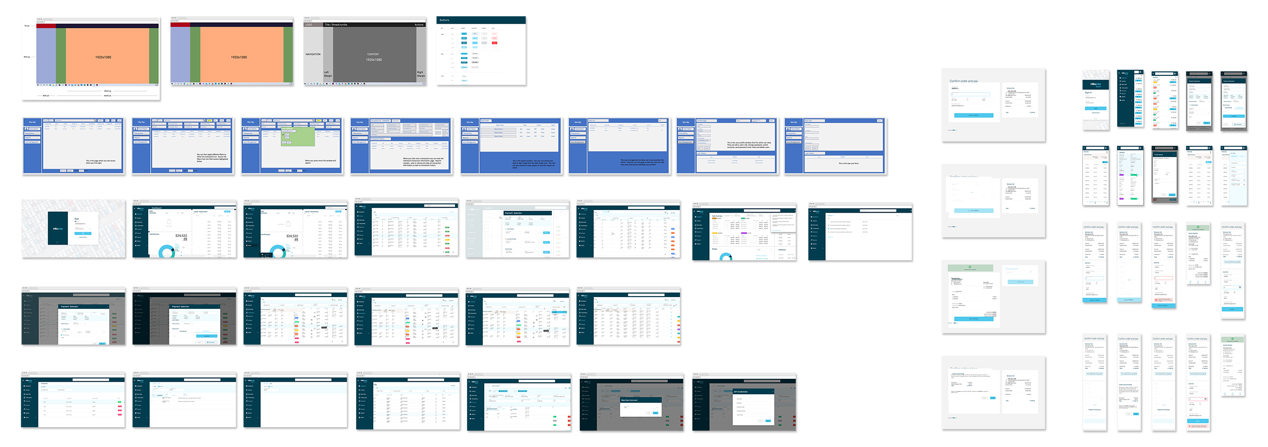
Developing a new POS system integrated with the existing DMS presented challenges for the users, who represented a diverse age group, with most being over 45 years old. It was crucial to ensure that any new tasks added were simple and not overly complicated for them. To address this, we conducted extensive research with dealer users and designed our application to offer a seamless 50% desktop and 50% mobile experience.
During the interviews, we gained valuable insights into their experiences with the manual process of switching between different applications. Our primary goal was to create a simple and efficient solution that eliminated the need for constant application hopping.
Process
Explore, Define, Design, and Deliver
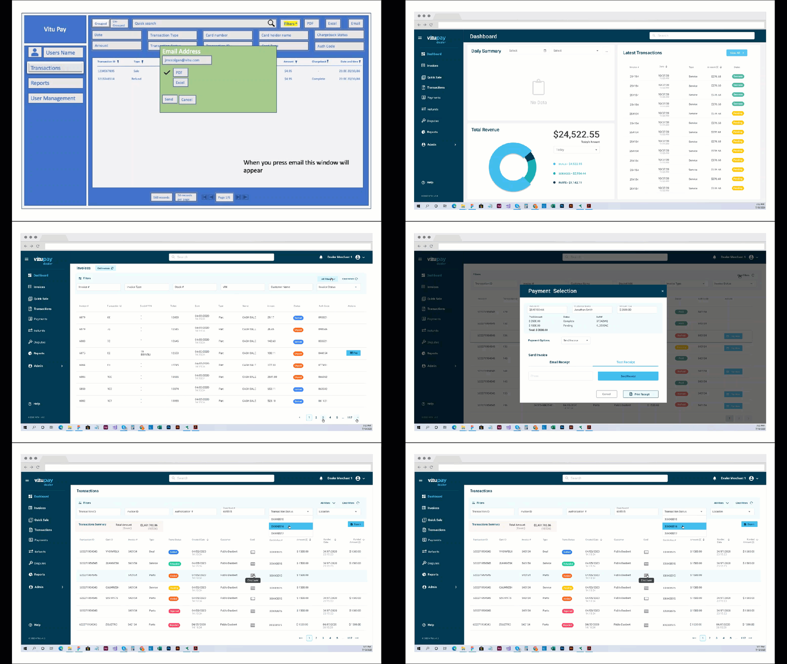
We followed the Human-Centered Design (HCD) process step by step. We started with user research to understand our users better. After analyzing insights from surveys and interviews, we clearly defined the problem and moved on to brainstorming ideas. From simple sketches to detailed prototypes, we gradually built the first version of the application. Currently, we’re testing how easy the app is to use and making improvements based on user feedback.

Design Decisions
#1 Designing for All Devices
Our objective was to ensure the application’s complete responsiveness across desktops, iPads, and mobile devices. Achieving the final design involved numerous iterations and user testing. Our design expertise leveraged Material UI components, aiding the development team in optimizing the user experience.
#2 Focusing on Targeted Actions
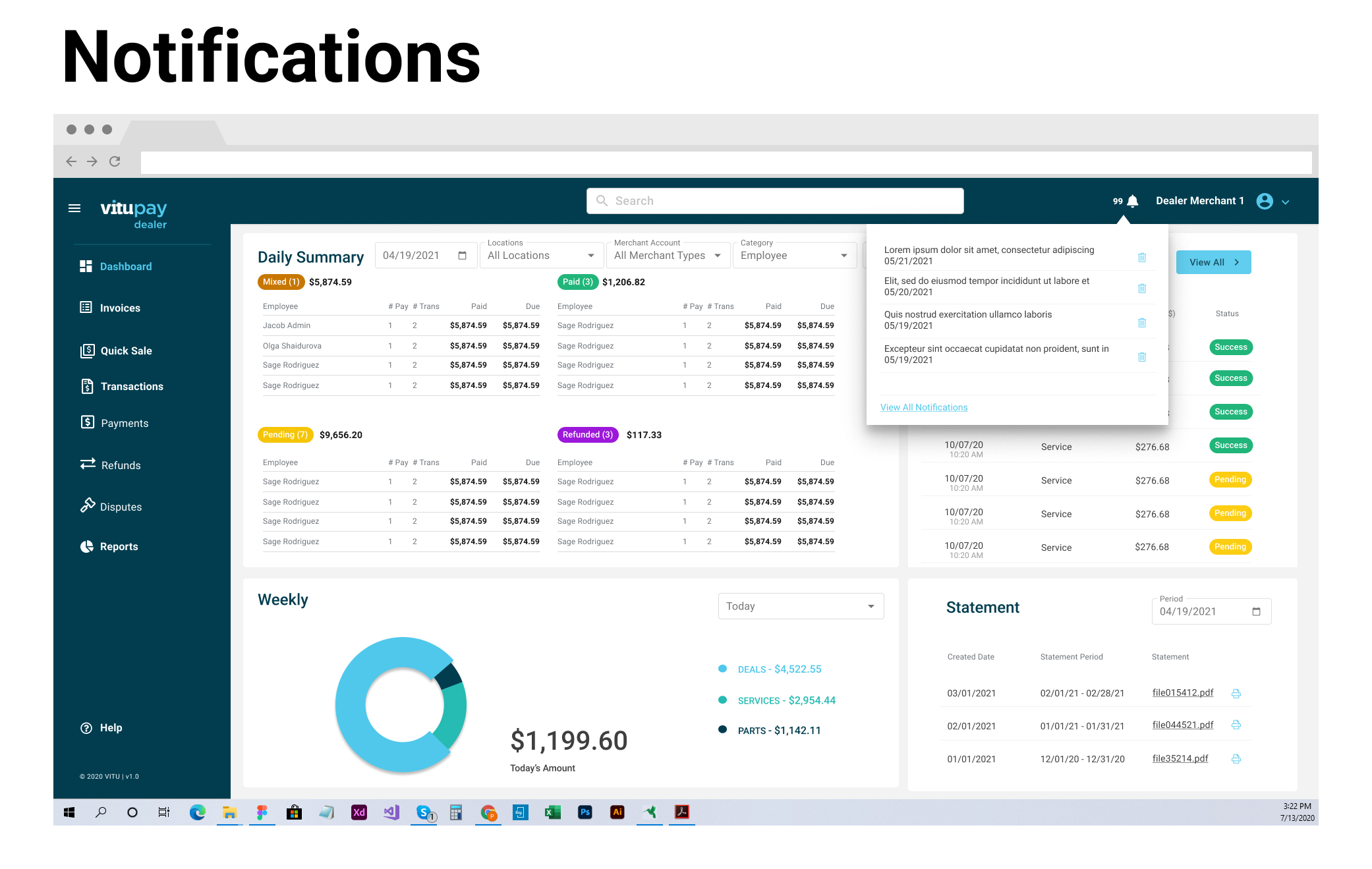
In pursuit of a personalized dashboard design, we collaborated with users to create a user-friendly app. Initially, I implemented scroll options on all pages. However, we decided to consolidate pages onto a single screen, eliminating the need for excessive scrolling.
#3 Enhancing Experience through Content Control
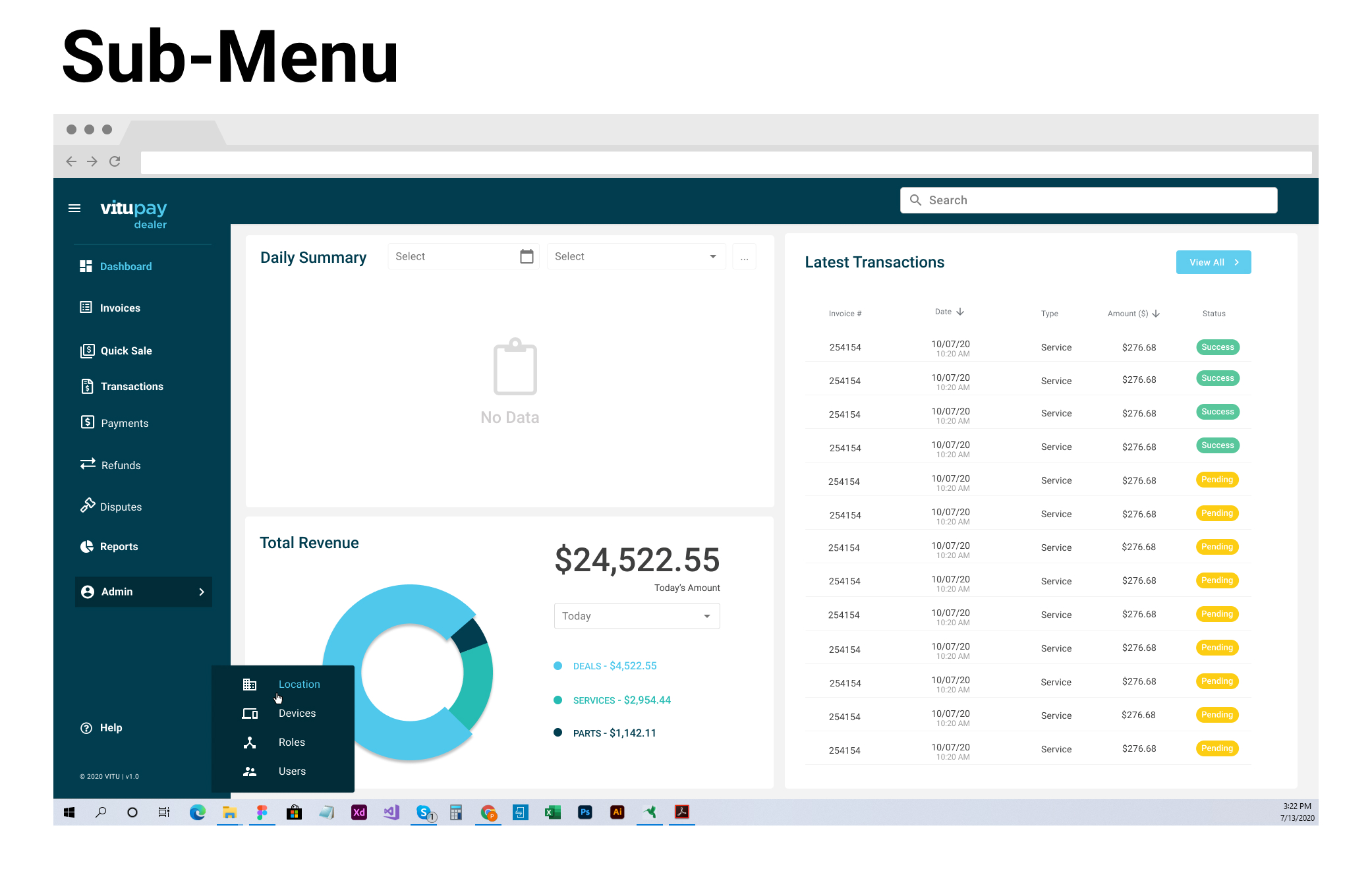
At a later stage, I encountered a minor disagreement with my Project Manager. The challenge was to display more data on the screen without overwhelming users. We devised a solution by introducing a hamburger menu option, allowing users to hide the left menu and display only icons with corresponding legends.
Showcase
Aiming for Flawless Design
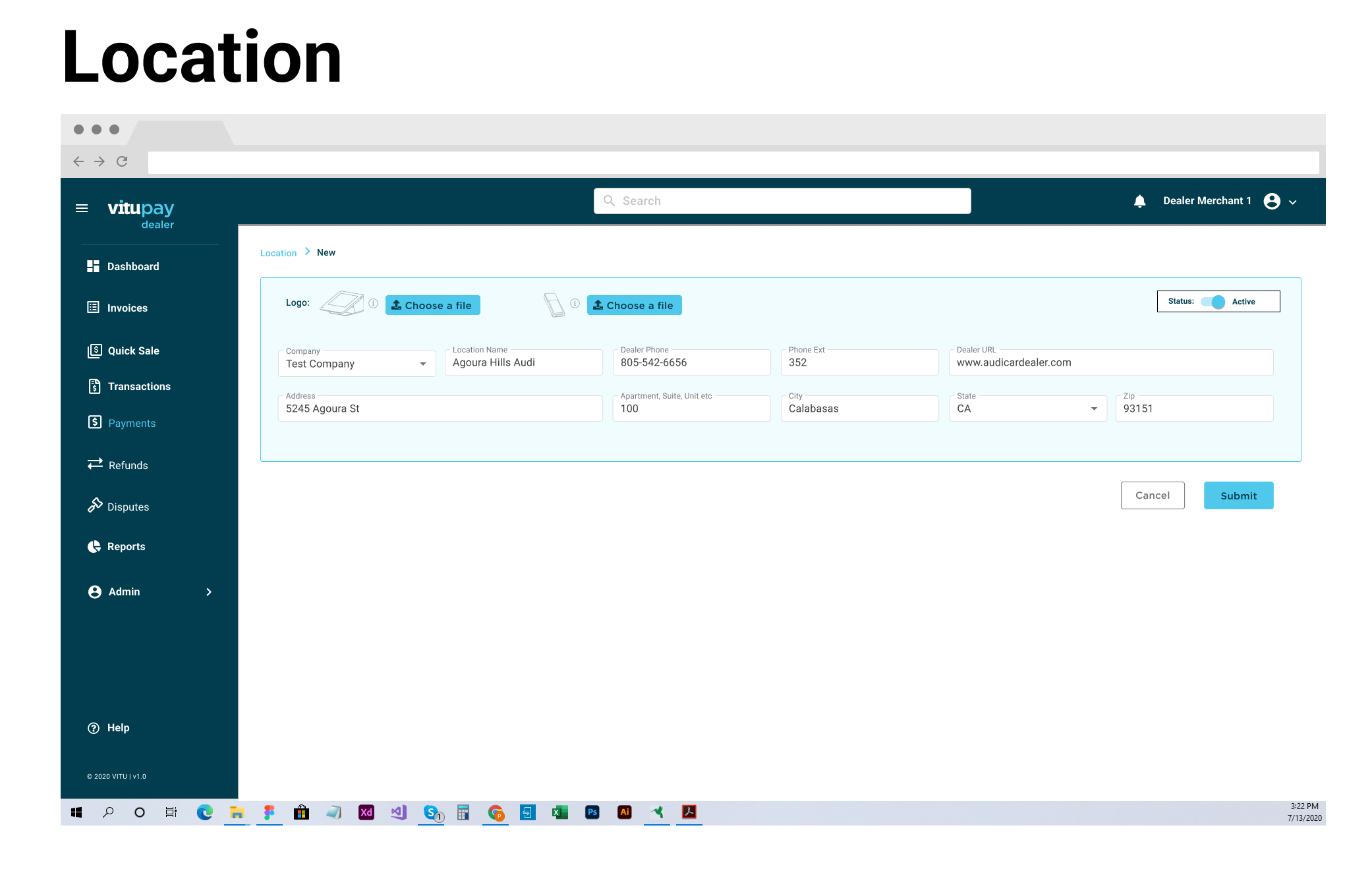
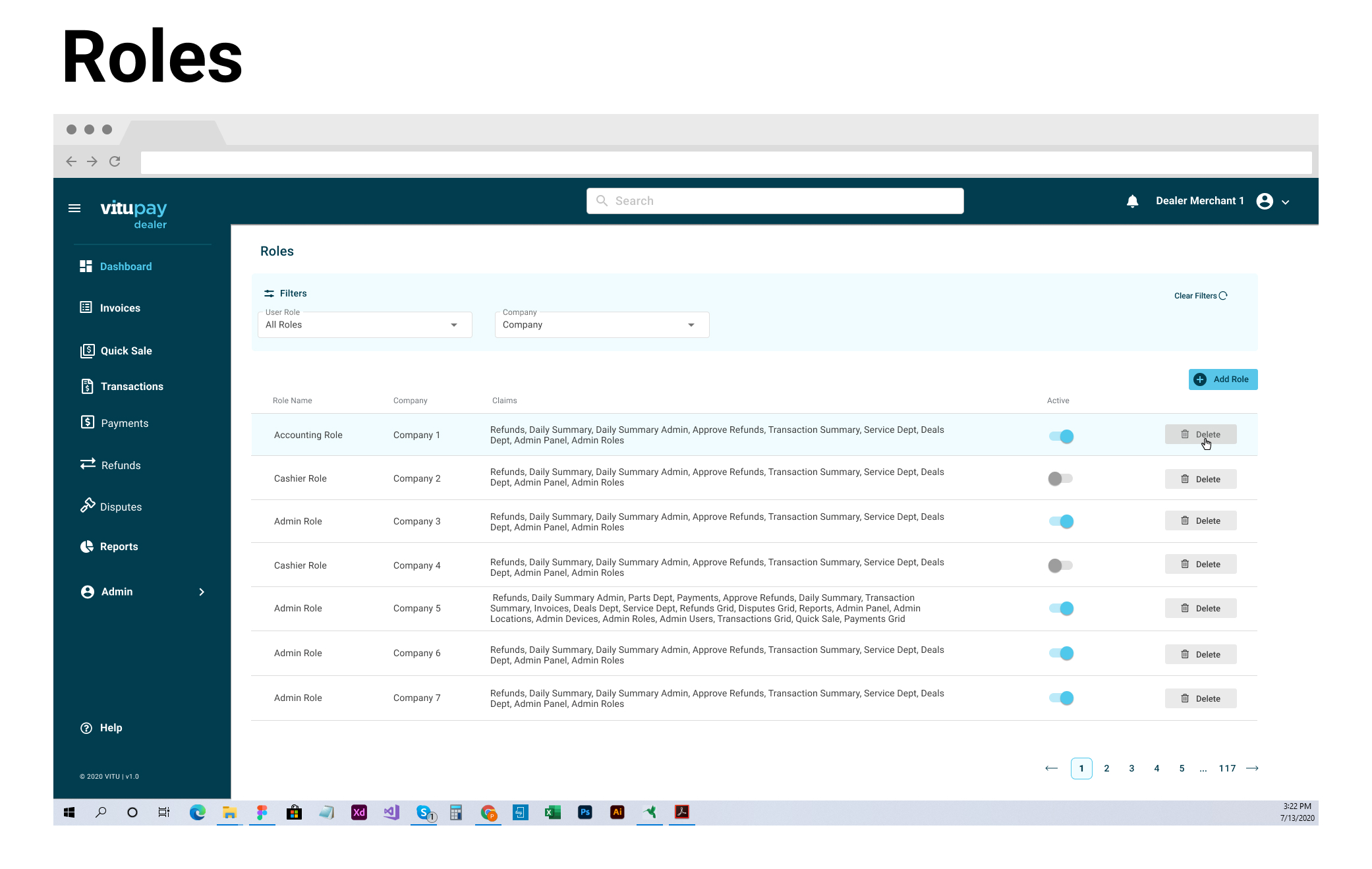
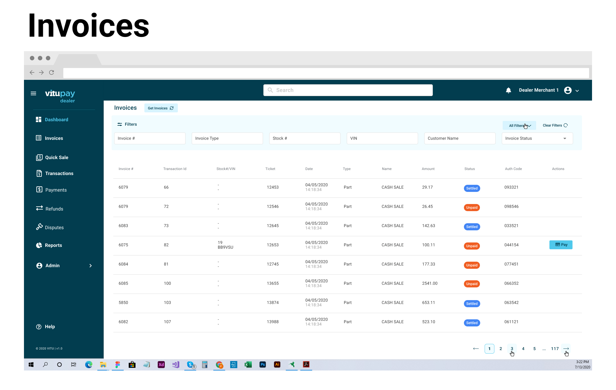
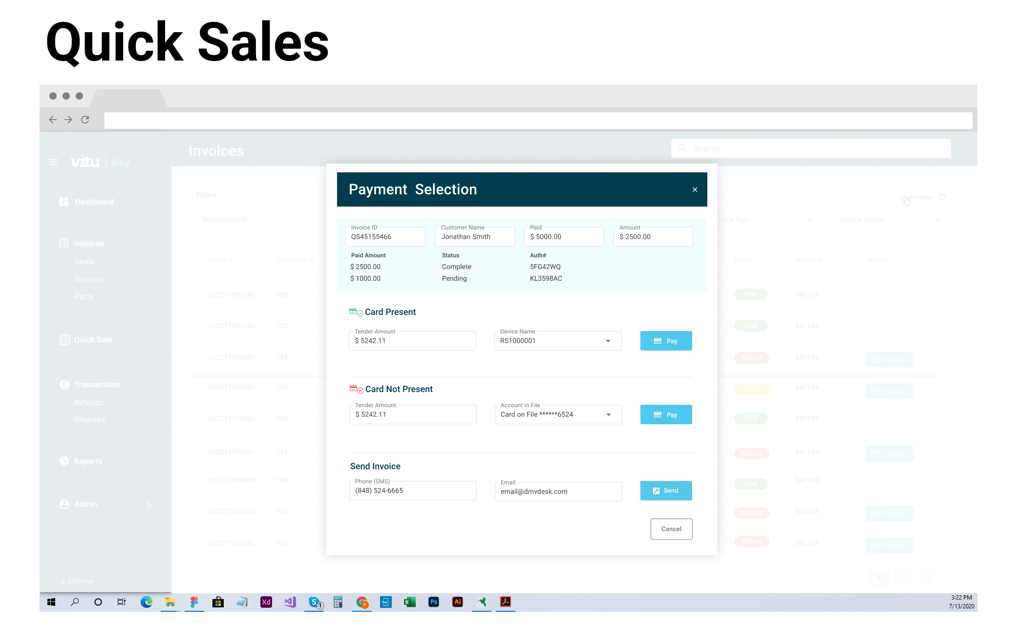
Usability tests are underway by the PM and researchers, and we will make improvements based on their feedback.
Reflections
Embracing Design as a Continuous Learning Journey
Through ongoing critiques and open communication, I’ve come to realize that design is an ever-evolving learning process, where designers share their experiences and insights to create the best possible user experience. It’s not a matter of “senior vs. junior” or “teacher vs. student” dynamics; the ultimate goal is always to deliver exceptional user experiences.
Recognizing the Boundaries of Knowledge
At the project’s outset, my main challenge was being unaware of my blind spots. As the project wraps up, I’ve gained a clearer understanding of areas where I need to expand my knowledge and the skills I should prioritize. I now have a better grasp of what defines quality. As we conclude the project, I’m committed to using the feedback we’ve received to continuously enhance the app.


